Showing posts with label infographics. Show all posts
Showing posts with label infographics. Show all posts
Where did my tax dollars go?
And now the winners of Google's "Data Viz Challenge"! The Grand Prize went to Anil Kandangath for the visualization above. Here's a description of the competition from the site:
"Every year, Americans fill out income tax forms and make a payment to the IRS. It’s an important civic duty, but it is also a lot of money. Where does it all go? Using data provided by WhatWePayFor.com, we challenged artists, coders, and the general public to create data visualizations that would make it easier for U.S. citizens to understand how the government spends our tax money."
Try out Anil's winning entry and the rest of the competition here:
Google Data Visualization Competition Winners
Web Design Evolution
Infographic from KISSMetrics exploring the history of web design over the last 20 years.
Read more:
Web Design Evolution: Two Decades of Innovation [INFOGRAPHIC]
Read more:
Web Design Evolution: Two Decades of Innovation [INFOGRAPHIC]
Visualizing Friendships Using Facebook's Social Graph
Paul Butler, a Facebook developer looks at a data visualization exploring the locality of friends.
"When the data is the social graph of 500 million people, there are a lot of lenses through which you can view it. One that piqued my curiosity was the locality of friendship. I was interested in seeing how geography and political borders affected where people lived relative to their friends. I wanted a visualization that would show which cities had a lot of friendships between them."
Read more and find a high res image here:
A World of Tweets
Geography mashup using HTML5, the Twitter API and Yahoo Places. Be sure to scroll down the page for lots of interesting stats.
Twiddle the knobs yourself at:
What a Hundred Million Calls to 311 Reveal About New York
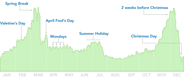
Breaking Up is Hard to Do (Unless It's Almost Christmas)
When are people most likely to break up? Mathias Mikkelsen discusses David McCandless' TED Talk, "The Beauty of Data Visualization", in which McCandless describes insights from analysis of over 10,000 Facebook status updates.
Check out the original TED Talk here:
Check out the original TED Talk here:
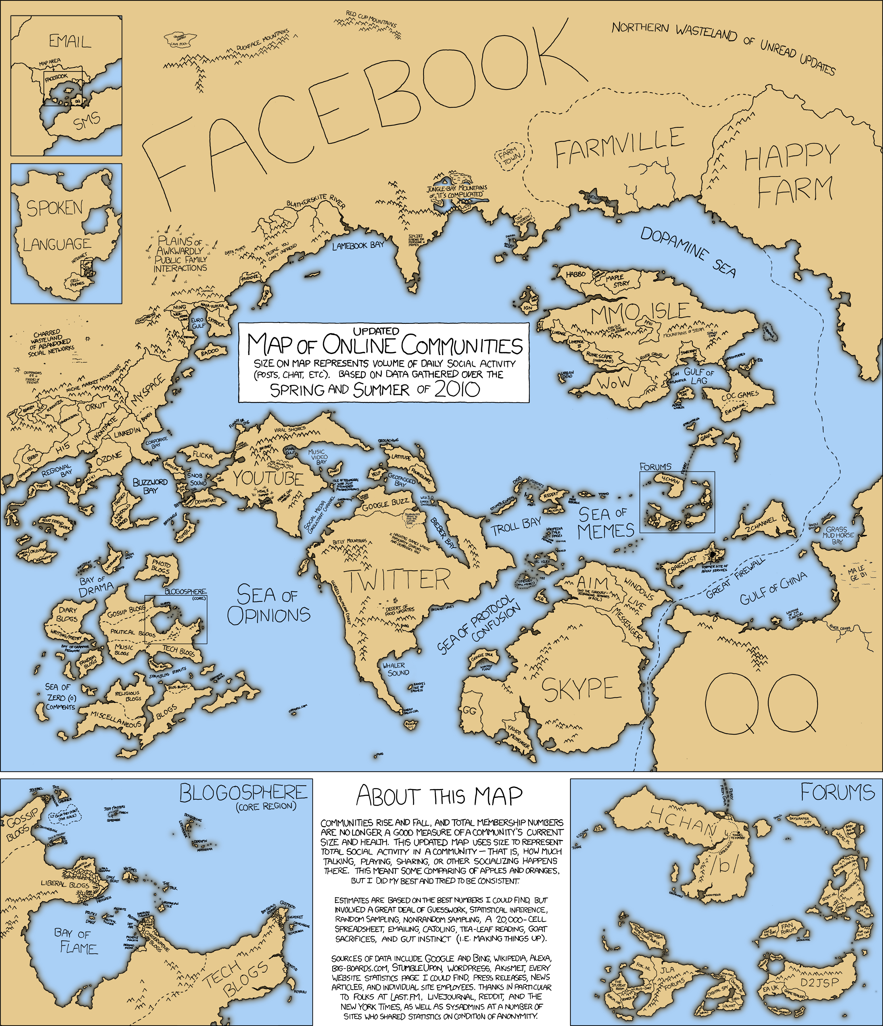
Map of Online Communities
Twitter Blog: The 2010 World Cup: a Global Conversation
Beautiful infographic displaying how Twitter usage and content evolved over the course of the World Cup. Enjoy!
Read more:
Twitter Blog: The 2010 World Cup: a Global Conversation
Read more:
Twitter Blog: The 2010 World Cup: a Global Conversation
Subscribe to:
Posts (Atom)


