Showing posts with label data visualization. Show all posts
Where did my tax dollars go?
And now the winners of Google's "Data Viz Challenge"! The Grand Prize went to Anil Kandangath for the visualization above. Here's a description of the competition from the site:
"Every year, Americans fill out income tax forms and make a payment to the IRS. It’s an important civic duty, but it is also a lot of money. Where does it all go? Using data provided by WhatWePayFor.com, we challenged artists, coders, and the general public to create data visualizations that would make it easier for U.S. citizens to understand how the government spends our tax money."
Try out Anil's winning entry and the rest of the competition here:
Google Data Visualization Competition Winners
What Twitter Learns from All Those Tweets
Twitter generates more than 12 terabytes of data a day – that's a lot of tweets. Their head of analytics talks about the kinds of insights they look for in this mountain of information.
Read more at Technology Review India:
What Twitter Learns from All Those Tweets
Read more at Technology Review India:
What Twitter Learns from All Those Tweets
Design Around the World: Metro Maps
Fascinating examples of information design, and how the same problem is solved in different parts of the world.
Design Around the World: Metro Maps | Webdesigner Depot
Hat tip: Chris Kaufman
Information is beautiful
Information is beautiful: 30 examples of creative infography
Hat tip to Inspired Magazine.
Shared via AddThis
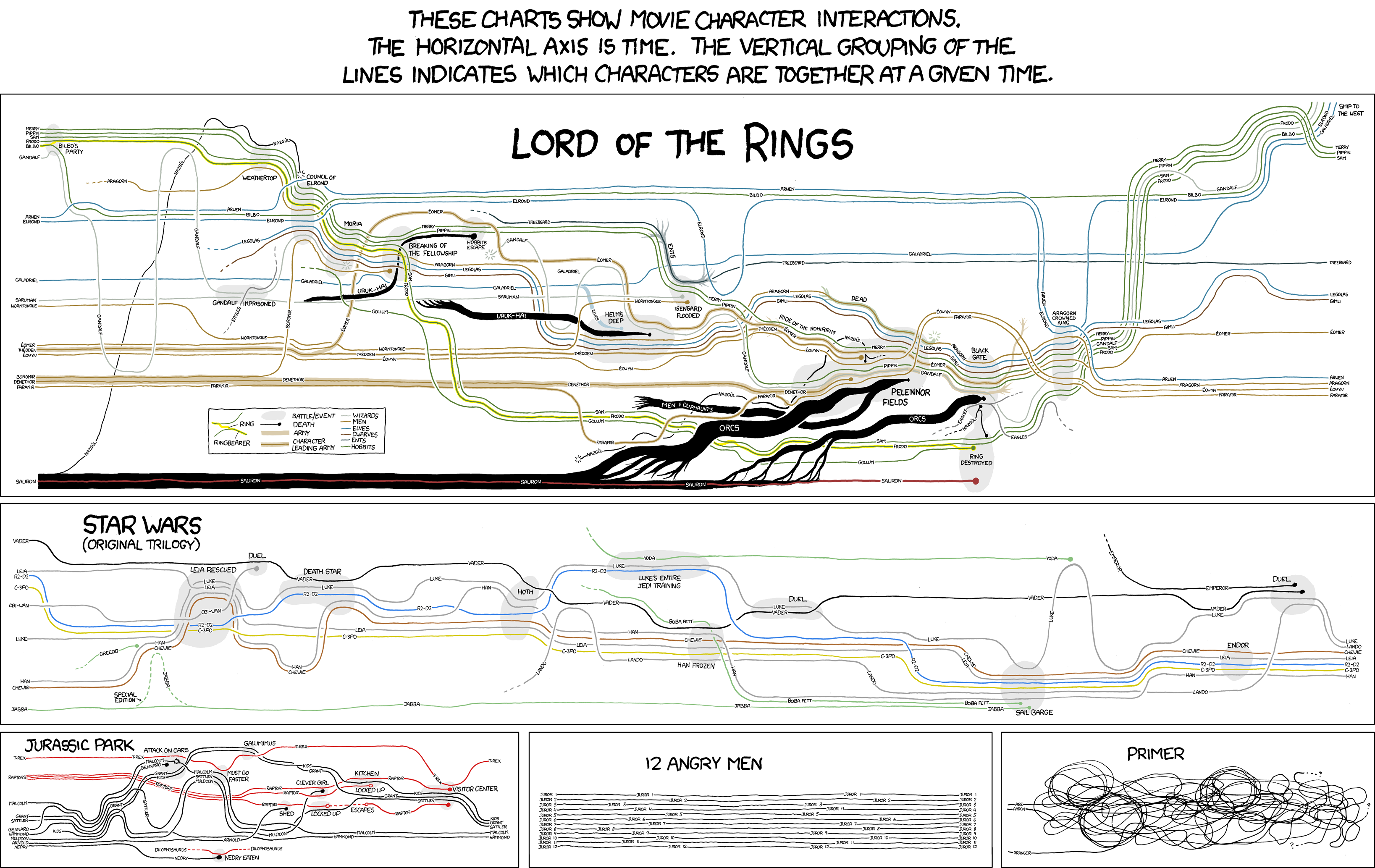
Where's Frodo?
Charting the Course of Characters in Lord of the Rings, Star Wars, and more!
Who Rules The Social Web?
This chart looks at gender distribution among social web sites.
Who Rules The Social Web? | Information Is Beautiful
Visualizing Music Discovery
This site was listed as a 2009 top 50 website by Time Magazine, although it's been around since 2006; I stumbled onto it at VisualComplexity.com. It has a fun interface that encourages interaction and play.
Musicovery : interactive webRadio
Shared via AddThis
Musicovery : interactive webRadio
Shared via AddThis
Textual clock screensaver
This is a fun little screensaver that displays the time as words (in Helvetica! although this can be changed.)
Simon Heys » Word Clock
Shared via AddThis from Smashing Magazine's article, 10 Creative Ways to Display Time. Enjoy!
Simon Heys » Word Clock
Shared via AddThis from Smashing Magazine's article, 10 Creative Ways to Display Time. Enjoy!
Emphasis of Scientific Disciplines in Different Countries
This is a data visualization (circa 2007) that illustrates and compares the emphasis of different areas of science by country. Be sure to zoom out; it takes some time to take in, but the differences are fascinating.
The Strengths of Nations
and another looking at which scientific areas produce the most patents:
The Scientific Paradigms that Support Patent Generation
and finally, an illustration of how scientific paradigms inter-relate:
How Scientific Paradigms Relate
Descriptions and discussion of these illustrations can be found here:
http://wbpaley.com/brad/mapOfScience/
Shared via AddThis
The Strengths of Nations
and another looking at which scientific areas produce the most patents:
The Scientific Paradigms that Support Patent Generation
and finally, an illustration of how scientific paradigms inter-relate:
How Scientific Paradigms Relate
Descriptions and discussion of these illustrations can be found here:
http://wbpaley.com/brad/mapOfScience/
Shared via AddThis
Nice mashup: GoPublic
Watching a book evolve: the preservation of favoured traces | ben fry
Darwin's best known work, "On the Origin of Species" saw major revisions over its sixth editions. This info-animation shows how this book changed across it's iterations. From the introduction by the author, Ben Fry:
"We often think of scientific ideas, such as Darwin's theory of evolution, as fixed notions that are accepted as finished. In fact, Darwin's On the Origin of Species evolved over the course of several editions he wrote, edited, and updated during his lifetime. The first English edition was approximately 150,000 words and the sixth is a much larger 190,000 words. In the changes are refinements and shifts in ideas whether increasing the weight of a statement, adding details, or even a change in the idea itself.
The second edition, for instance, adds a notable "by the Creator" to the closing paragraph, giving greater attribution to a higher power. In another example, the phrase "survival of the fittest" usually considered central to the theory and often attributed to Darwin instead came from British philosopher Herbert Spencer, and didn't appear until the fifth edition of the text. Using the six editions as a guide, we can see the unfolding and clarification of Darwin's ideas as he sought to further develop his theory during his lifetime."
the preservation of favoured traces | ben fry
Shared via AddThis
"We often think of scientific ideas, such as Darwin's theory of evolution, as fixed notions that are accepted as finished. In fact, Darwin's On the Origin of Species evolved over the course of several editions he wrote, edited, and updated during his lifetime. The first English edition was approximately 150,000 words and the sixth is a much larger 190,000 words. In the changes are refinements and shifts in ideas whether increasing the weight of a statement, adding details, or even a change in the idea itself.
The second edition, for instance, adds a notable "by the Creator" to the closing paragraph, giving greater attribution to a higher power. In another example, the phrase "survival of the fittest" usually considered central to the theory and often attributed to Darwin instead came from British philosopher Herbert Spencer, and didn't appear until the fifth edition of the text. Using the six editions as a guide, we can see the unfolding and clarification of Darwin's ideas as he sought to further develop his theory during his lifetime."
the preservation of favoured traces | ben fry
Shared via AddThis
Search, Trends and Google
Ok, I can admit I have a problem: I love usage data. It's fascinating to peek into the numbers behind a user experience and try to understand not just what users are doing, but why and how. More about data and AddThis later, but years ago at AOL I designed the original "Hot Searches" product that showed which search terms were rising and falling the fastest. From these humble beginnings grew two fun AOL programmed destinations, Hot Searches and AOL's year end Hot Searches retrospectives.
More recently, Google has integrated their Hot Trends data into search results, one more volley into the battle of real-time search:
Google Hot Trends Integrated Into Google Search via SearchEngineLand
Shared via AddThis
More recently, Google has integrated their Hot Trends data into search results, one more volley into the battle of real-time search:
Google Hot Trends Integrated Into Google Search via SearchEngineLand
Shared via AddThis
Subscribe to:
Posts (Atom)